A little more to explore…
Client project / Website refinement / Service architecture / Responsive UX
Veritano Consulting.
Refined an existing WordPress / Elementor consulting website: clearer service architecture, responsive service cards, cleaner content and contact paths, while preserving the Nimo design system.
Project URL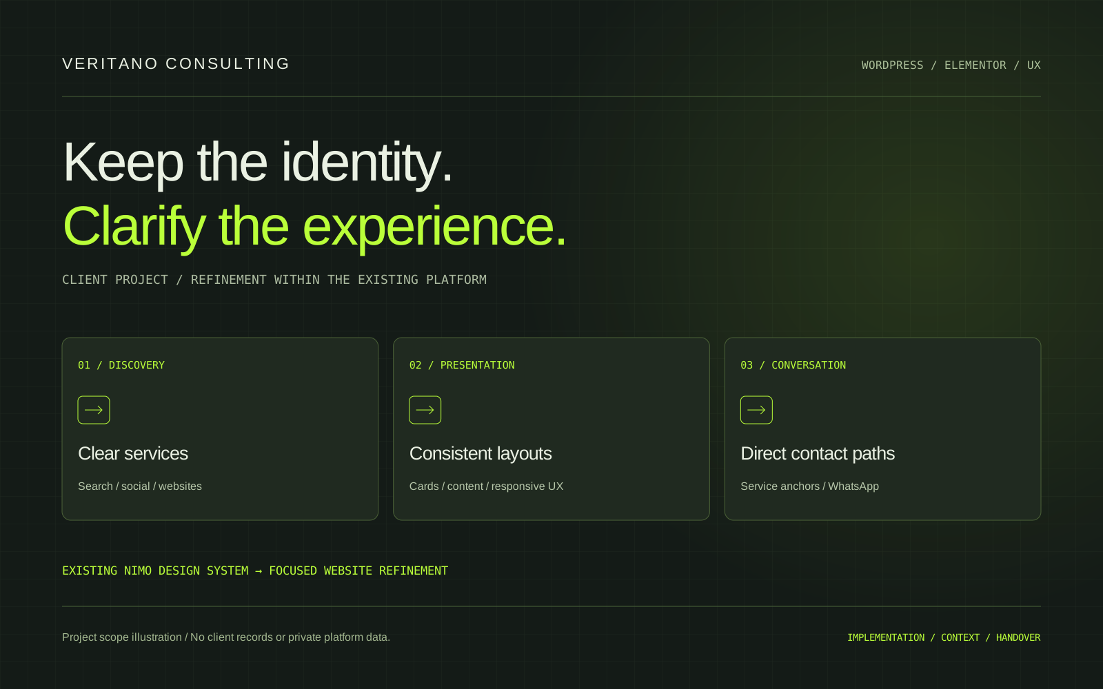
The implementation map
EXPLORE EACH PART OF THE SYSTEM
01 / SYSTEM COMPONENT
Review the existing system
Identify theme-demo content, repeated images, unclear service links, contrast issues and inconsistent spacing without discarding the established visual identity.
ARCHITECTURE OVERVIEW / THIS PORTFOLIO DOES NOT RUN THE CLIENT’S PRIVATE SYSTEM.
Evidence / engagement record
Checks at handover.
| Check | Recorded result |
|---|---|
| Existing foundation | WordPress / Elementor / Nimo Child retained |
| Primary service categories | Search marketing, social marketing, website development |
| Service cards | Three-column desktop; two-column tablet; single-column mobile |
| Services navigation | Direct homepage services-section anchor |
| Primary conversation CTA | Connected to company WhatsApp |
| Commercial improvement metrics | Not measured in the supplied project account |
These are implementation outcomes described in the supplied project account, not a new live-site audit. Business counters and testimonial layouts on the client website are not evidence of this project generating revenue, satisfaction or conversion gains.
01 / THE IMPLEMENTATION
The problem and context
Veritano Consulting offers website development, digital marketing and search engine marketing. Its existing WordPress site had a strong visual foundation but still showed signs of its Nimo theme demo: generic copy, repeated imagery, inconsistent service presentation and unclear navigation. Duplicate contact details, low contrast and awkward card distribution weakened the experience. The task was to make the site more specific to the business while retaining the established design system.
02 / THE IMPLEMENTATION
What this demonstrates
The priorities were clearer service discovery, more consistent content, a cleaner enquiry route and responsive presentation. The existing typography, colors, animations and card styling were to remain recognizable. This was a focused website refinement, with practical improvements to the parts visitors use to understand the offer and start a conversation.
03 / THE IMPLEMENTATION
The decisions
I worked within WordPress, Elementor and the Nimo Child Theme. The homepage introduction was simplified by removing a redundant brand heading and giving the company description more emphasis. The hero CTA was directed toward services. Decorative theme assets could remain where they contributed to the visual identity; obvious demo imagery, irrelevant team references and generic copy were treated separately for cleanup.
04 / THE IMPLEMENTATION
Content and data
The homepage services were organized around Search Engine Marketing, Social Media Marketing and Website Development. SEM was clarified as SEM (Google Ads) in the menu, and the incorrect SSM label was corrected to SMM (Meta & TikTok). Supporting content gave Google, YouTube and display advertising, social advertising and website services clearer context. A generic Why Choose Us area was replaced with more useful website-package starting points: Business Presence, Business Growth and Premium Experience.
05 / THE IMPLEMENTATION
Implementation
I configured the existing Elementor / Nimo widgets and applied targeted frontend refinements rather than introducing a separate design language. Services navigation linked directly to the homepage services section. The main conversation CTA connected to the company WhatsApp channel. Email presentation was simplified into a clean clickable address, unnecessary Mail prefixes and duplicate contact entries were removed, and repeated contact widgets were reviewed. A theme-native testimonial component was used so its visual behavior matched the site.
06 / THE IMPLEMENTATION
Validation approach
Service cards received distinct imagery, consistent proportions and clearer heading contrast. Desktop presentation used three equal cards in one row, tablet used two cards followed by one, and mobile stacked cards in a single column. Spacing across service lists, buttons, descriptions and section headings was refined. The About-page image review distinguished decorative assets from repetitive demo content, with attention to rounded crops, composition and an existing image-to-background fade.
07 / THE IMPLEMENTATION
The result
The resulting structure presents the consulting business through clearer service categories, more balanced cards and more direct contact paths. The existing brand language remains intact, while generic theme content and inconsistent service terminology have been reduced. Website packages provide a more concrete next step for visitors who are evaluating a website engagement.
08 / THE IMPLEMENTATION
Evidence and limitations
The supplied account describes responsive review across desktop, tablet and mobile, focusing on card layouts, text wrapping, spacing, image proportions and CTA placement. The portfolio records those implementation changes without claiming an independent current audit or measured improvement in enquiries. Statistics displayed on the client website are not presented as results attributable to my work, and no client testimonial quote is reproduced here.
09 / THE IMPLEMENTATION
Handover and next steps
The handover direction was to maintain the existing WordPress and Elementor foundation with more consistent content and reusable service presentation. Future performance or conversion evaluation would require its own baseline and measurements. This case is scoped to the documented website refinement, service architecture, responsive UX and contact-path work.
Have a related task?
Bring the workflow.
We’ll clarify the next scope.
KimageLMS
Let’s scope the next task
GOOD WORK STARTS WITH A CLEAR BRIEF.
What needs
moving forward?
A WordPress issue, a small feature or a backlog item? Start with one clear brief. Availability, scope and timing are agreed before work begins.
SCHEDULED COLLABORATION / PKT · UTC+05:00
new-inquiry.md